Total Pageviews

Showing posts with label sharpies. Show all posts

Wednesday, November 12, 2014

Adventures in Sharpies

Welcome to Adventures in Sharpies!  
I absolutely adore Sharpies, especially the colored ones.  I have a whole bag filled with Sharpies that I pull out from time to time to draw with.  
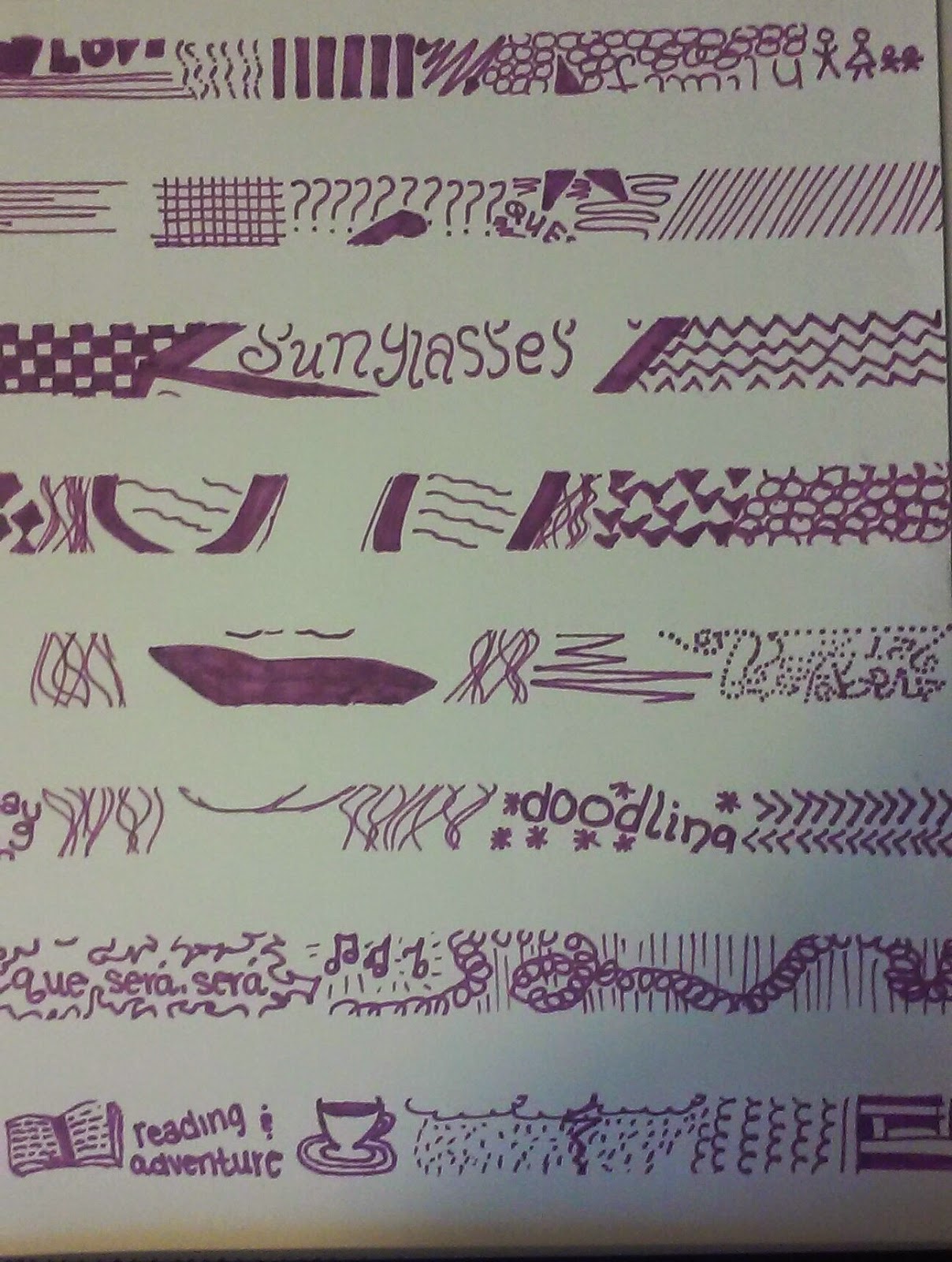
This first picture is monochromatic of the purple variety.  I first put drafting tape (I think) in strips across the paper, then drew my picture.  Finally, when I was all done, I removed the drafting tape and this was my end result.  It's not my favorite piece, but I do think it's rather interesting all the same.  
This next piece is super fun, even if it is a little out of focus.  There are multiple colors of Sharpie and many many pictures all crammed into one rectangular sheet of paper.  I love the chaotic quality of this piece and I plan to do many more like it!


 This next work is one of my favorites.  The center figure is colored with colored pencil and is a gentle progression from green to blue.  The simplicity of the central figure contrasts greatly with the chaos that surrounds it.  There are multiple words surrounded with symbols, shapes, and pictures..  Sometimes when I'm stuck on what to draw, I just think of all the things I love or hate or want to do and I write and draw about them.  Can you spot all the words?  Hint: There are 15 of them, I believe.


This page is all about patterns.  The paper is basically sectioned off into different patterns.  There are circles, straight lines, curved lines, triangles, squares, checkerboard, rhombuses, and more!


 This piece was inspired by an online picture of a candle sitting on a desk.  I referenced it to get the shape of the candle and the candlestick, but everything else came right out of my imagination.  I used oranges, yellows, and reds for the candle and flame.  The wood it's setting on was created using browns, oranges, and blacks.  And the craziness that is the background was created with all kinds of colors.  I just wanted to make sure that the background was all straight, severe lines.


I drew this final picture when I was at a local coffee shop called JP's.  That's where I took the logo of the two cups from.  You can see the original logo and learn more about the coffee shop here.


Tuesday, November 11, 2014

Random Other Art Pieces from the Past


Welcome to Miscellaneous Works of Art!!!  I'll probably come back to all these posts and add dates to the pieces of art when I can dig through my stuff to find them. 


This first piece is done in watercolor, and the cross was inspired by my friend Bekah's tattoo.  It's incredibly similar to her tattoo except for the color of the flower and the number of leaves.  I decided to do the immediate background of the cross in yellows and then darker colors around that to make it really pop out at the viewer.  Around that was a black background.  Later, after everything had dried, I took real leaves from outside and placed them on the page and then "watercolored" the edges.  I still don't entirely know why I decided to put the leaves on there, but I am glad that I did.  It gives something to the right hand side of the paper that otherwise would have been static and boring.

This next piece is also a watercolor (not done on watercolor paper, unfortunately).  It's based off of a modeling picture of my sister, Mary.  I love the way she's standing and the flow of the contours of the body.


 In my Sophomore year of college I was sitting in my friend's room and saw some metal or plastic birds mounted on the wall.  They were beautiful and I decided to draw two of them.  As it turned out, it looks more like one bird with a lighter "shadow" underneath it - I liked the overall effect and so decided to keep it.  I then decided to play with my sharpies for the background, using many vibrant colors in swirly twirly patterns.

Also during my Sophomore year I drew a cross.  The cross itself isn't very sophisticated.  You can see that the "arms" of the cross are different lengths.  However, the background is something more.  The cross, yellow, and inner red sections are done in colored pencils, while the darker red and the black background are done in.... yup! Sharpie again!


This picture (bottom left) is based off of a picture of me modeling on a car for my friend Jessica's art project.  Trust me, the picture is a LOT crazier than this drawing.  If you want to see it, click here.

 I did this final composition (above right) in my Freshman year of college, so in the Fall of 2010.  First I drew the bookshelf and television.  I scanned it onto my computer and then upped the contrast.  Finally I reprinted that off and then drew in Lisa and Bart.  After scanning it back onto the computer, I used the eyedropper tool on Paint to access the actual colors for their skin and clothes, and voila!

Basic Drawing I Class - Junior Year of College 2013

These pieces were created in 2013, during my Basic Drawing I class taught by Bruce McCombs.  All of these were drawn, not only off of pictures, but also of real objects sitting in the room in front of me (Yes, even the rib cage; we had an actual skeleton to work off of). 

This first drawing of the rib cage is incomplete.  I did finish it, but I gave it to my teacher and forgot to capture a picture of the final project.  The rib cage itself and the spine and vertebrae were drawn in pen, with lines and cross hatching to darken certain areas.  The background is... can you guess?  Sharpie!  I love sharpies and decided to do an intricate, somewhat abstract background using multiple colors.  


 This second piece (yes, those are my feel in the picture) is of a tricycle.  The entire tricycle is done in pen and ink, with the background being orange/red chalk (I think my teacher called it "cani chalk" but I can't find that name anywhere online, so.....).  The very bottom is in black, charcoal I believe.  It's basically a drawing of a person doing a drawing of a tricycle.


 This is another drawing of the same tricycle.  I had finished the first one and was sitting in class with nothing to do.  We were supposed to do two drawings of the tricycle, but I had put so much effort into the first one that I just felt completely uninspired.  So, what did I decide to do?  Why I decided to draw with my left hand, of course!  And no, I am NOT left-handed.  The end result actually turned out pretty well.  Who'd have thought I could draw with my left hand?  I certainly never thought I could!  So, next time you're stuck on what to draw, you can always draw the same picture you'd already done, but this time do it with your non-dominant hand.


 The quality of this next photo is not great, but hopefully you get the idea that I drew a skull.  I THINK this piece is in watercolor, with some black gouache for the eyes, nose, mouth, and background.  If you don't know what gouache is, you can find a reasonable definition here on good old Wikipedia.

Hey look, I found some more!  

This is a heroic drawing (which basically means a blown up or larger than life drawing) of a ring I had.  It's done on Newsprint with black and white charcoal.  It's not super sophisticated; it's really just a quick sketch of the ring, really. 


This next drawing is also a heroic drawing.  This one is of a rubber band ball.  I know, you probably didn't guess that, because quite honestly, it doesn't really look like one, now does it?  The answer is no.  BUT, I had a lot of fun with it because I used oil pastels and then smeared the heck out of them.  It made for a pretty sweet effect.  


This next image is clearly a Jack Daniel's bottle.  I don't know, it might be a little hard to read on the computer, but that's definitely what it is!  How funny is it that on a dry campus you can go into the basic drawing room and find an entire table filled with alcohol bottles?  Anyways, I just used graphite pencil for this drawing.  

Finally, the bags.  There are two bags pictured here.  The first is a Hallmark bag that says, "Life is a Special Occasion."  It was done in oil pastels, which allowed me to mix a variety of different colors, such as blues, purples, and whites to create a more dynamic color scheme for the bag, instead of it just being a regular plain purple background.  The second bag (the one on the right) is a plain old jane old brown paper bag.  There was nothing really remarkable about it, but I decided to draw it anyways.  I do like working with monochromatic works, and so this was the perfect opportunity for me!.  The medium is watercolor.